Flows are a very useful way for developers to create standardize business processes and perform actions in Salesforce, without writing any code. Some examples of where Flows can be useful include helping your Customer Service team provided consistent service across your organization by standardizing questions and scripts, or Flows can be used internally to help maintain data integrity.
When you embed your Flow into your user’s UI, you will usually do this by adding the Flow as a component to a Visualforce Page. When you do this, you receive the ability to customize some of the look and feel of your Flow; options that are not available in the Flow Designer.
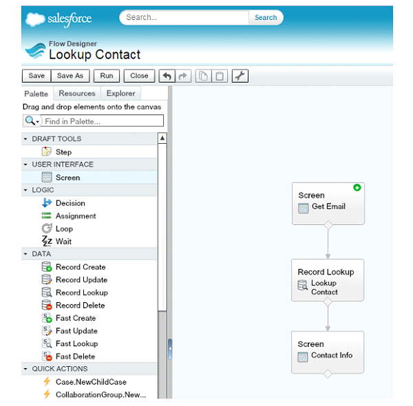
To illustrate this example, I have put together a simple Flow with 3 steps:
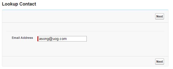
- Get an email address from the user via a textbox
- Lookup a Contact with that email address
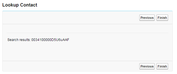
- Display the retrieved Contact Id
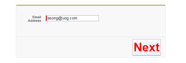
When I run the Flow in the Flow Designer, this is what the UI looks like:
However, by adding a few CSS elements, I can customize the look of each of my buttons and the size of the div that contains the Flow.
[crayon-6114a0be2cc5b480850788/]The CSS update I made to the Flow aren’t really practical, but you can see how if your users are having a hard time finding a button, or get mixed up between two buttons a lot, you can use color coding or text formatting to help improve the usability of your Flow.
You can find the complete list of customizable attributes here:
What Certification are you studying for now?
Focus on Force currently provides practice exams and study guides for sixteen certifications

